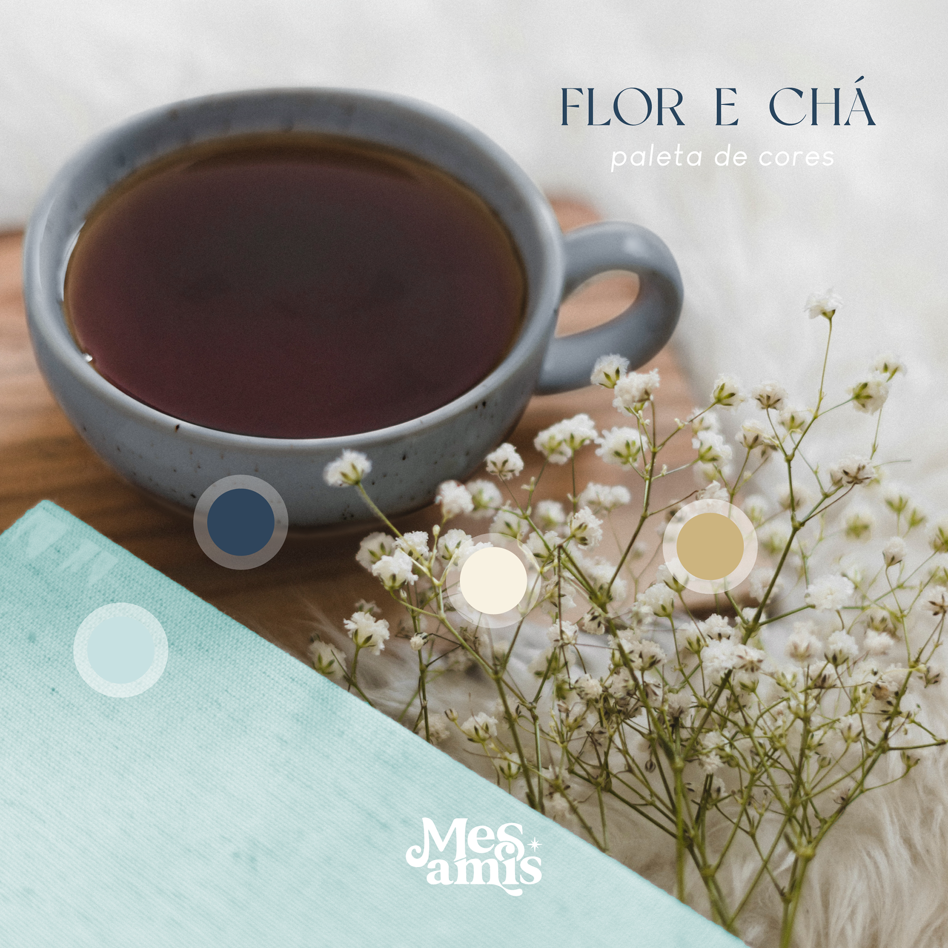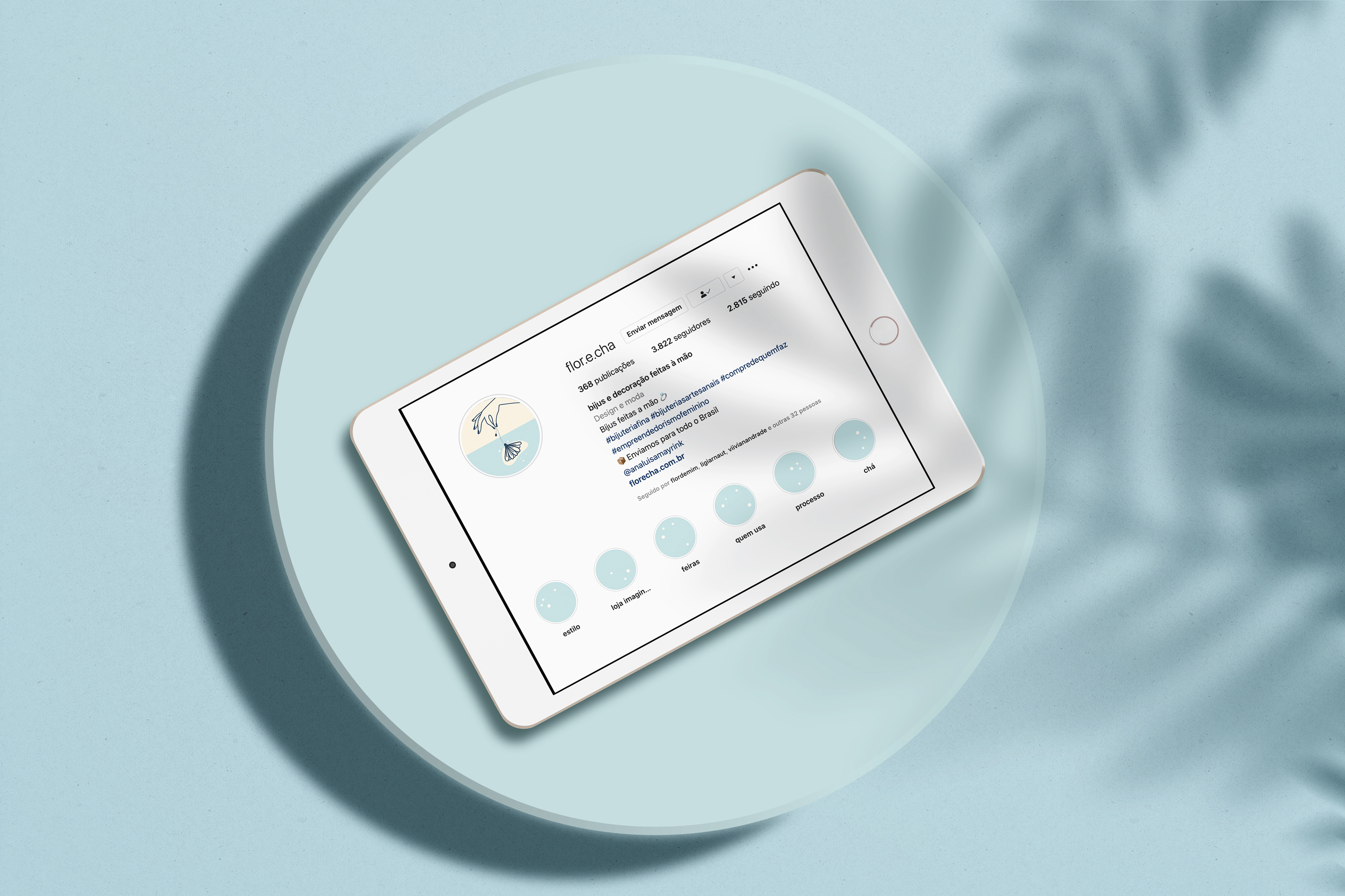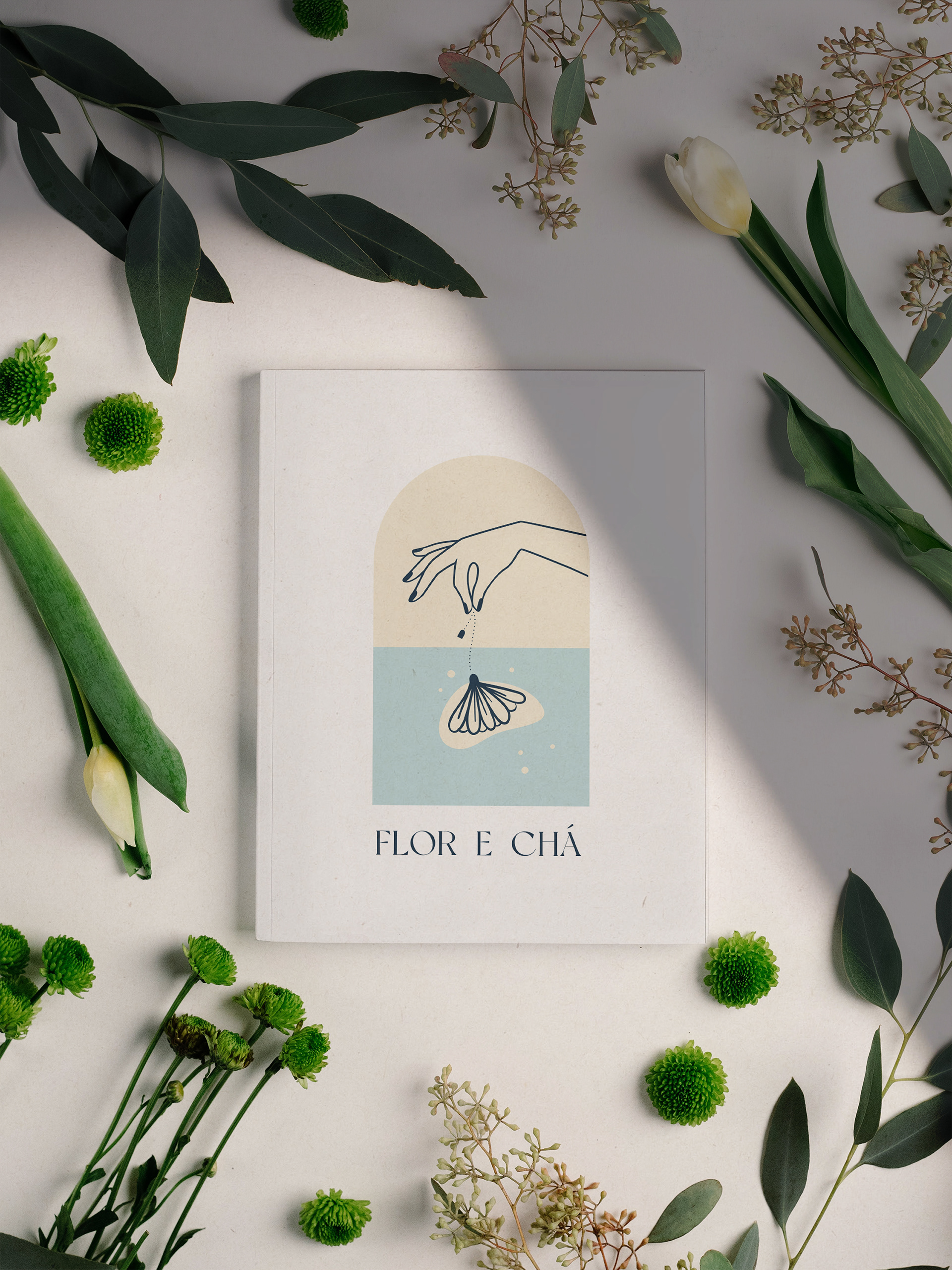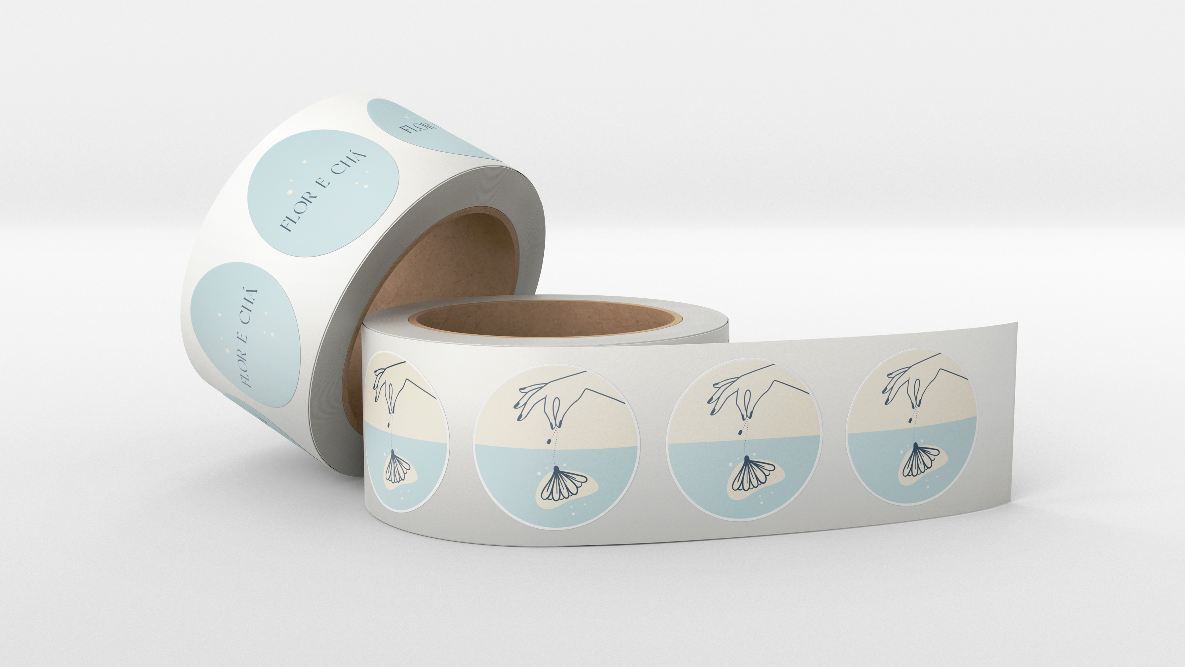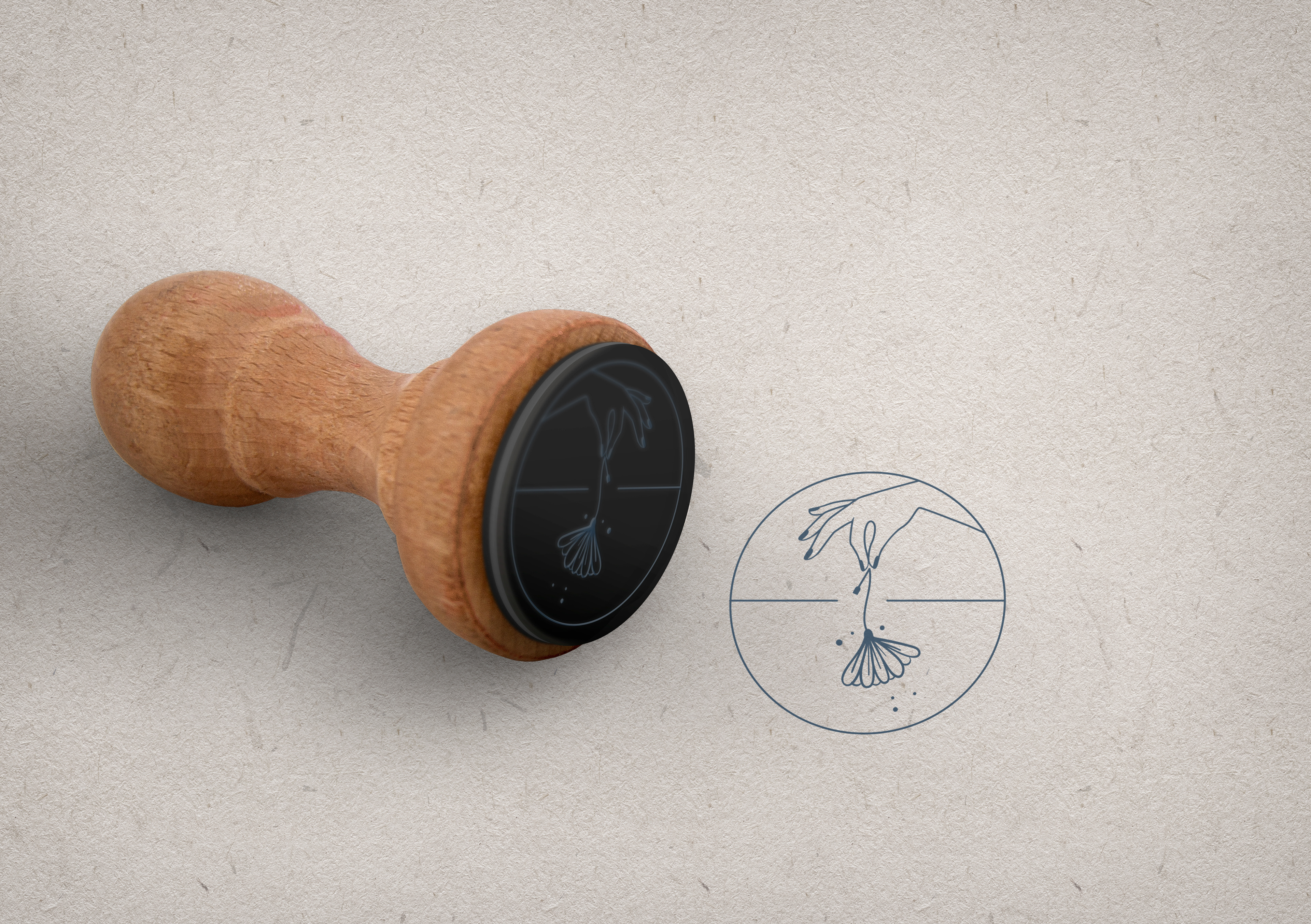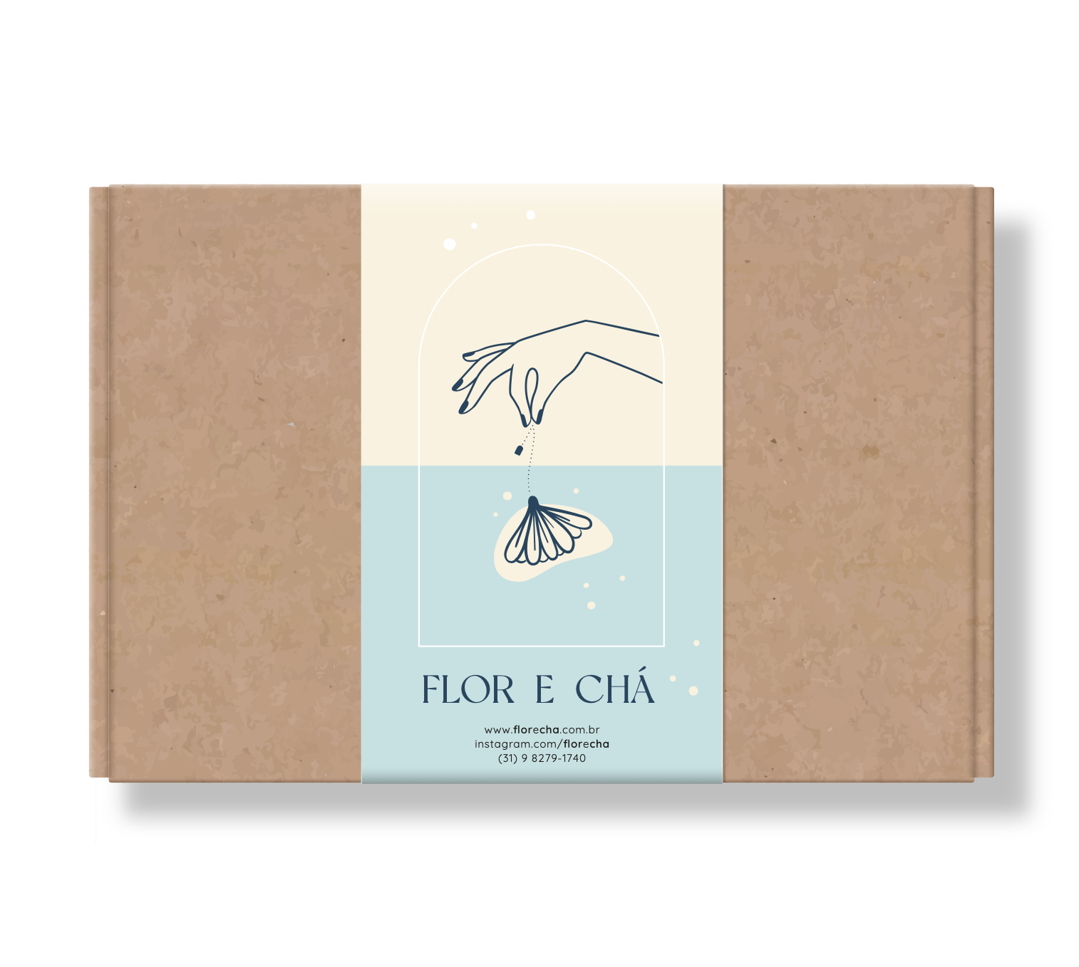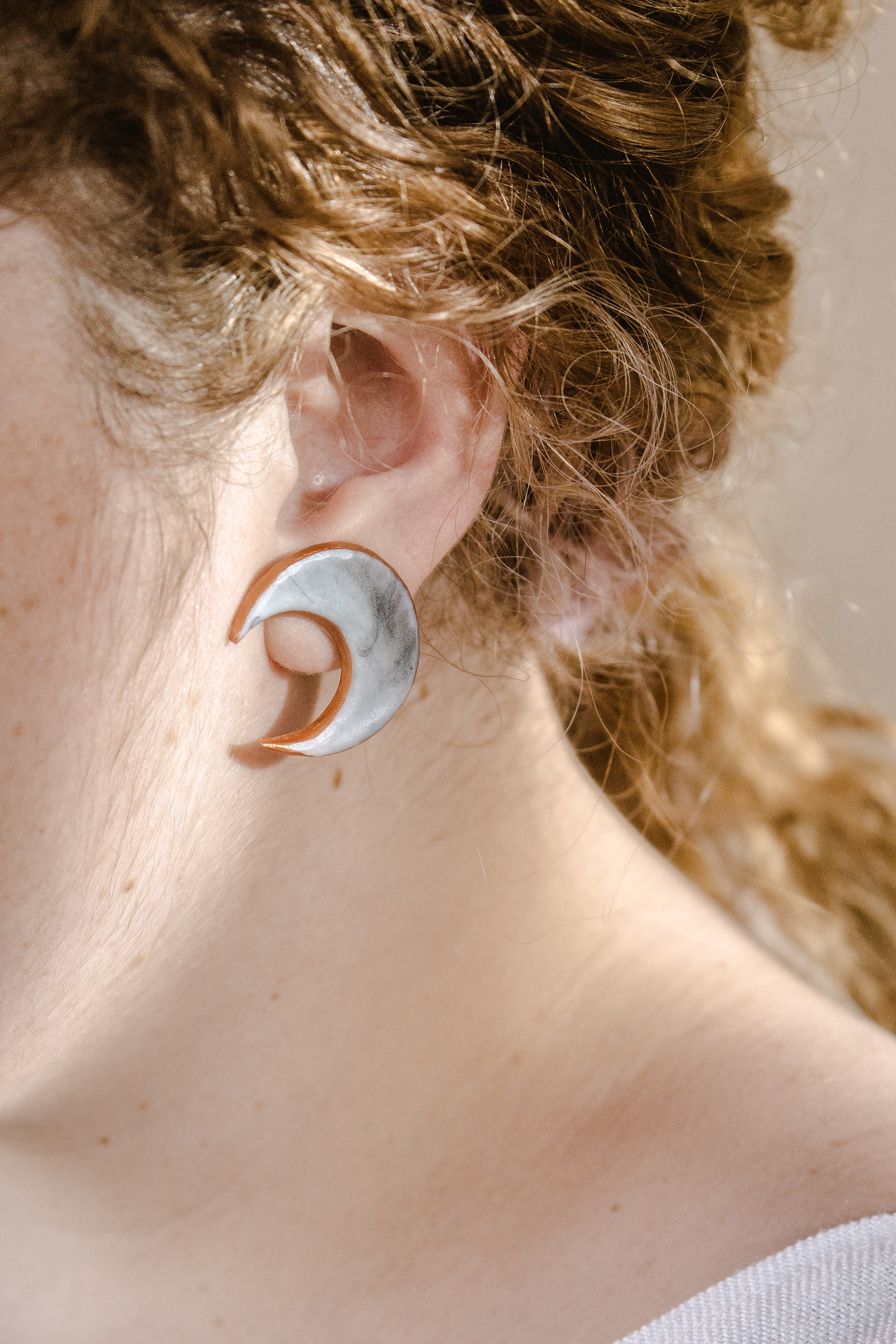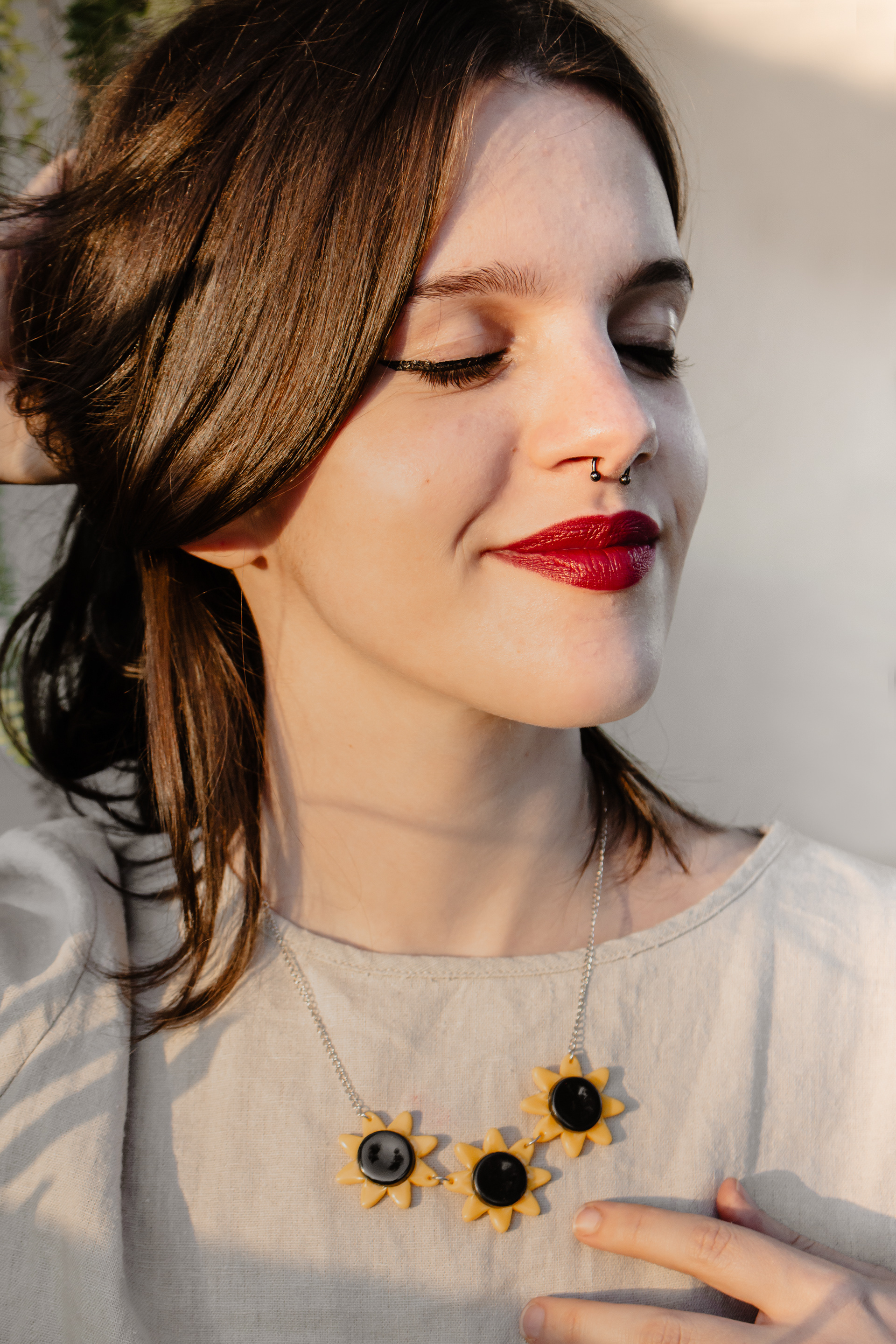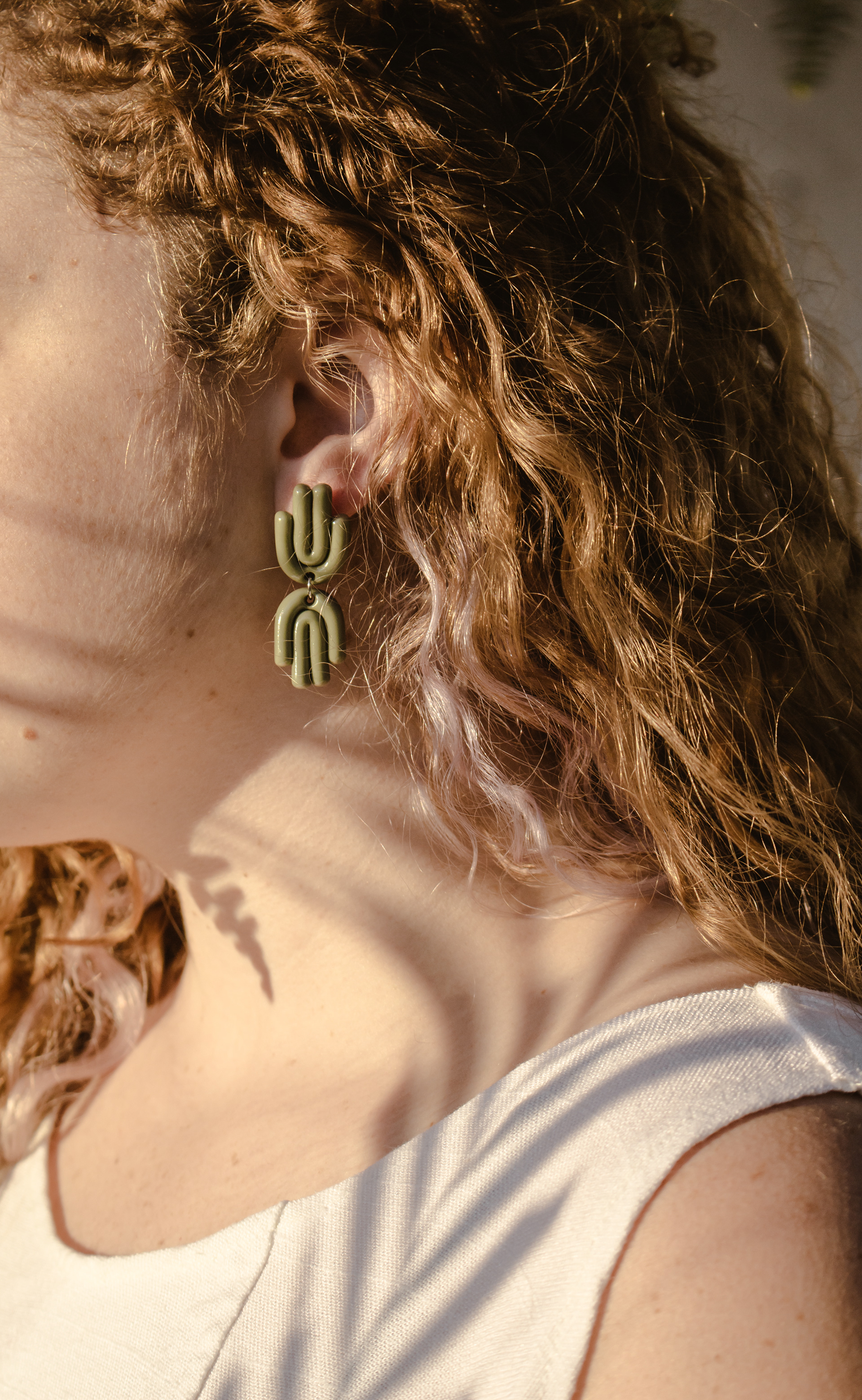


The redesign of the Visual Identity for the handcrafted accessories brand “Flor e Chá” was a thoughtful process aimed at preserving the emotional connection with its customers. The light blue, a staple in the brand’s history, was retained as the main color, while a new color palette was created to bring even more harmony and personality. The project also included photography designed to present the pieces in alignment with the new identity. Every detail was crafted to reflect the brand’s essence: the tea string evokes a necklace, the flower symbolizes tea, and the sachet-like shape reinforces this connection. These elements come together in a composition guided by a hand that embodies the care and craftsmanship behind the accessories.
